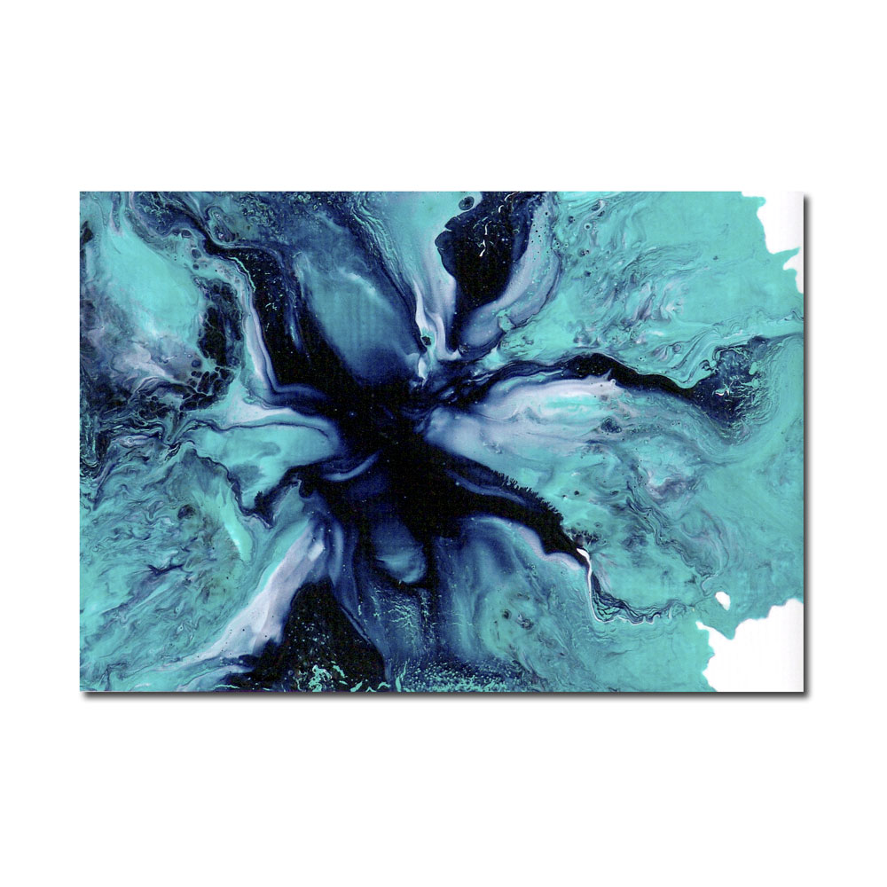
 I must admit to having a bit of a love affair with the color turquoise. As blues go, it is one of the most versatile and works wonders in painting abstract landscapes. My favorite is cobalt teal. When combined with a deep navy blue and white, it really sets (and changes) the mood of the landscape, as in my aceo painting Night Storm. See how the turquoise helps form the shapes of the background while at the same time illuminating the landscape?
In a larger abstract, I increased the ratio of turquoise and white to navy to give the landscape a lighter feel. By The Light Of The Moon also has a dreamy surreal quality, but it is not ominous. Instead, the turquoise color illuminates as if to show the calm after the storm, or light as seen from beneath the water’s surface.
For me the most versatile aspect of turquoise is that it easily moves from a cool tone to a warm tone with the simple addition of orange. My favorite to mix with turquoise is nickel azo gold, a rust orange with gorgeous yellow undertones. Here in Tempest, the turquoise mingles with the orange to create a lovely Aegean Sea green, fitting the mood of the painting perfectly.
Take a session or two to experiment with turquoise in your abstract landscapes. You just might be pleasantly surprised at the results.