Many artists have favorite go-to colors. Mine are blues and oranges. With those two colors plus white, I can create a palette which includes green-blues, yellows, and many derivatives of gray.
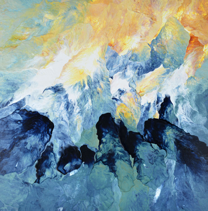
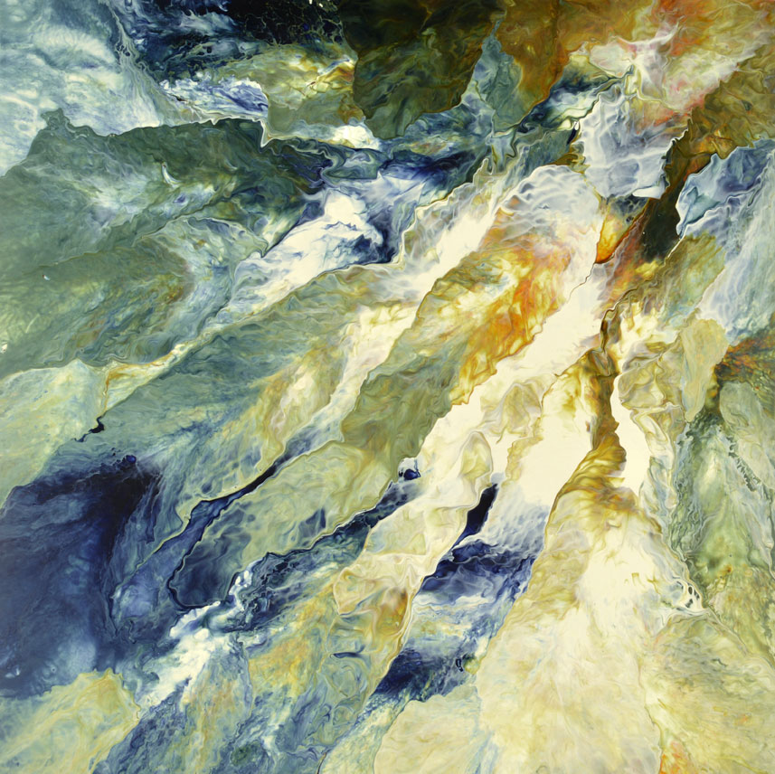
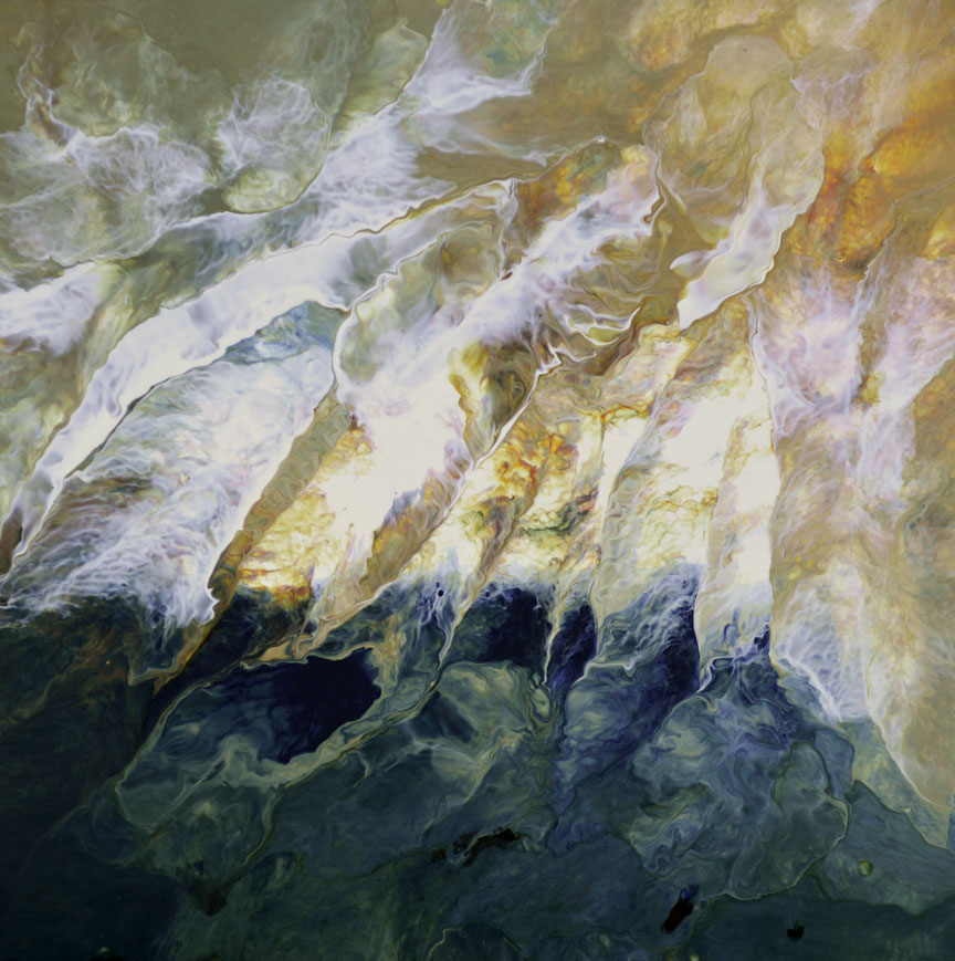
Take my two recent abstract paintings, for example. Hard to believe I used exactly the same colors of navy blue, rust orange, and white, isn’t it? The difference is the ratio in which those colors were applied to the paper. This particular painting style is very free-form, very open–allowing the paint palette the freedom to blend and merge at will on the paper or canvas. I’ve heard artists speak about how paintings often reveal themselves…and this is exactly what happened with both of these paintings.
In Blue Mountains, the shades of blue formed from the ink-like navy blue are more pure; there is less blending of yellow tones from the orange paint.
Eye Of the Storm II, on the other hand, allows much more interaction between the orange and navy, creating a greater tonality of gray-green and yellow than in Blue Mountains. And in Eye Of the Storm I (below) notice how the white separates the yellow from the blue, considerably altering the color landscape from its successor.
So for me, a simple (or basic) palette is not boring…but instead allows me to create paintings with a complimentary tonality–working effectively for a series or commission requests for custom work.
To see more abstract art in this style, please visit my Abstract Paintings Gallery.


